Submitted by Dick’s Brewing Company

After 20 years of brewing delicious beer Dick’s Brewing Company has given itself a little make over with a new logo, new packaging and a revamped Dick’s I.P.A. recipe!
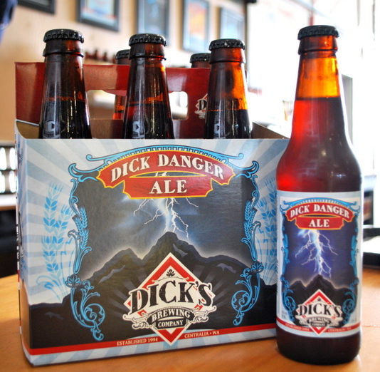
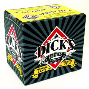
Staying true to the original red diamond logo of Dick’s Brewing Company, the new design adds a little more pop and pizazz with an embellished “DICK’S BREWING COMPANY” design within a thicker red diamond. To keep the same feel the designer retained the original artwork adding a consistent border and location of the beer style to each label. The new Dick’s Brewing Company logo is located at the bottom of each and every label for consistent branding.
The new packaging was unveiled the summer of 2014 for only the Core Products of the brewery which include the flagship Dick Danger Ale, India Pale Ale, Golden Ale, Cream Stout, Lava Rock Porter, and Working Man’s Brown Ale. The new label design also includes the Twentieth Anniversary Black I.P.A. Midnight Ride. The remaining labels will hit the market throughout 2015.
Julie Young, the Owner of Dick’s Brewing Company has said, “The response to our new labels and new logo have been super positive! We are excited to be moving forward to usher in the new era of Dick’s Brewing Company while we continue to brew the beer that everyone has so faithfully enjoyed for the last 20 years.”
The new I.P.A. is brewed with the Northwest hop head in mind. Our NW I.P.A. has all the bitterness along with the late dose of Cascade, Centennial and Columbus hops that really  come across in the nose and in the flavor. We hope you enjoy our revamped and redesigned I.P.A.
We’ve stepped up our social media game…come find us!
Like Us on Facebook: Dick’s Brewing Company
Follow Us on Twitter: @dicksbrewing
Follow Us on Instagram: @dicksbrewing
Follow Us on Pinterest: @dicksbrewing


