


Submitted by southsoundgreen.org
In the face of COVID-19 and recent stay at home order, parents and guardians may find themselves looking for activities that not only keep students engaged, but also provide information about local environmental science and concerns. In our South Sound GREEN Home Based Science Project series, we will introduce and demonstrate various hands-on and at-home activities for children of all ages to do either indoors or outside!
![]() This time, we put together all of our water quality activities and learn how to present data effectively!
This time, we put together all of our water quality activities and learn how to present data effectively!
Data Deductions
Grade Level: 5th-8th
Materials
- Pen/pencil and paper
- Optional – thermometer
Background
Happy end of the school year! We know that this year was certainly different than normal, but we’ve seen students respond to the challenging situation in amazing ways. Unfortunately, this year we were unable to host our annual Student GREEN Congress, where hundreds of students from around the South Sound area gather at Evergreen State College to collaborate and share water quality data that they collected throughout the school year. Congress is an amazing opportunity for students to meet their peers and analyze the health of their watersheds, but to do so they need effective ways of measuring and displaying the health of their watersheds.
In our Water Quality Monitoring program, students typically test four water quality parameters that we’ve covered in our ThurstonTalk articles: dissolved oxygen (DO) (Soda Science), turbidity (Turbidity Trials), nitrates (Nitrate Bingo), and pH (Acidification in Action). But collecting the raw data doesn’t actually tell the whole story. Organizing values into a data table may organize the numbers a little better, but numbers on their own aren’t very useful without context, so scientists will compare these numbers to optimal, or ideal, values. In the case of our water quality, optimal values are the best case scenarios for salmon health. If our water quality parameters all exceed their optimal values, we can predict that the water is healthy enough to support salmon. In the case of Congress, hundreds of students are presenting their data from dozens of local sites, so sharing only their data tables may not relay their findings quickly and effectively. We need a fast way to interpret the data, and the best way to do that is visually with graphs.
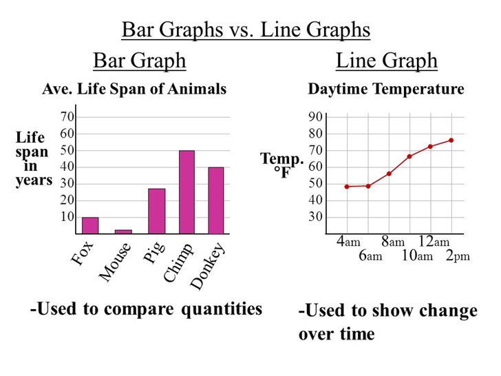
There are a few different types of graphs we can use to represent data. The most common one we use for water quality data is a bar graph, which uses bars of different heights to represent differing values – the higher the bar, the greater the value. Our students will test water quality of the same site twice a year, in October and February, to be able to compare the water quality from one season to another. Their data bar graphs will therefore have two bars, one for each site visit. If the same class went water quality testing over years and years and wanted to see the change in data over time, they might use a line graph, which places all the data points on a single, continuous line.
By using graphs, we can quickly see which water quality parameters are within optimal ranges for salmon, and which sites may have unhealthy water that needs to be addressed. In this activity, you’ll graph real data collected by SSG students this past year and determine if it is healthy for salmon!
Procedure
- Look at the following data table, created by students at Pioneer Elementary School from water quality data collected at their test site along the Deschutes River. They tested for six parameters: the four we mentioned above, along with B.O.D. (which stands for biochemical oxygen demand, or a way to measure how much bacteria is in the water) and temperature. They also represent their optimal values as “What organisms like”.
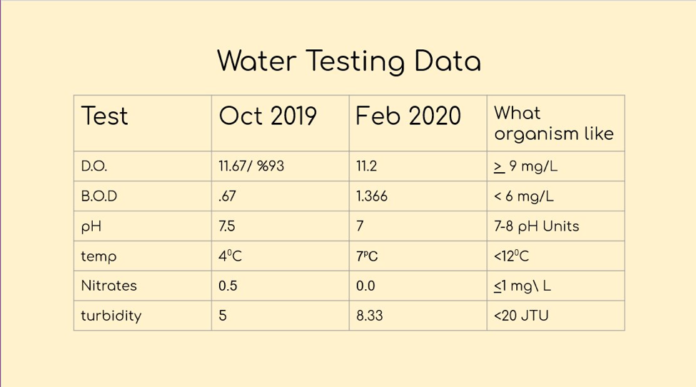
- Look closely at the data table. Remember, this data table is a lot more organized than just a sheet of numbers, but probably not as easy to interpret as a graph. Can you tell if this water is healthy or not based only on the data table?
- It turns out that all of these data values are within the optimal values for salmon! But let’s see if we can make the data easier to visualize with a bar graph. We’re going to focus on temperature data, so circle the temperature data in the data table. Then make your temperature bar graph with the template below.
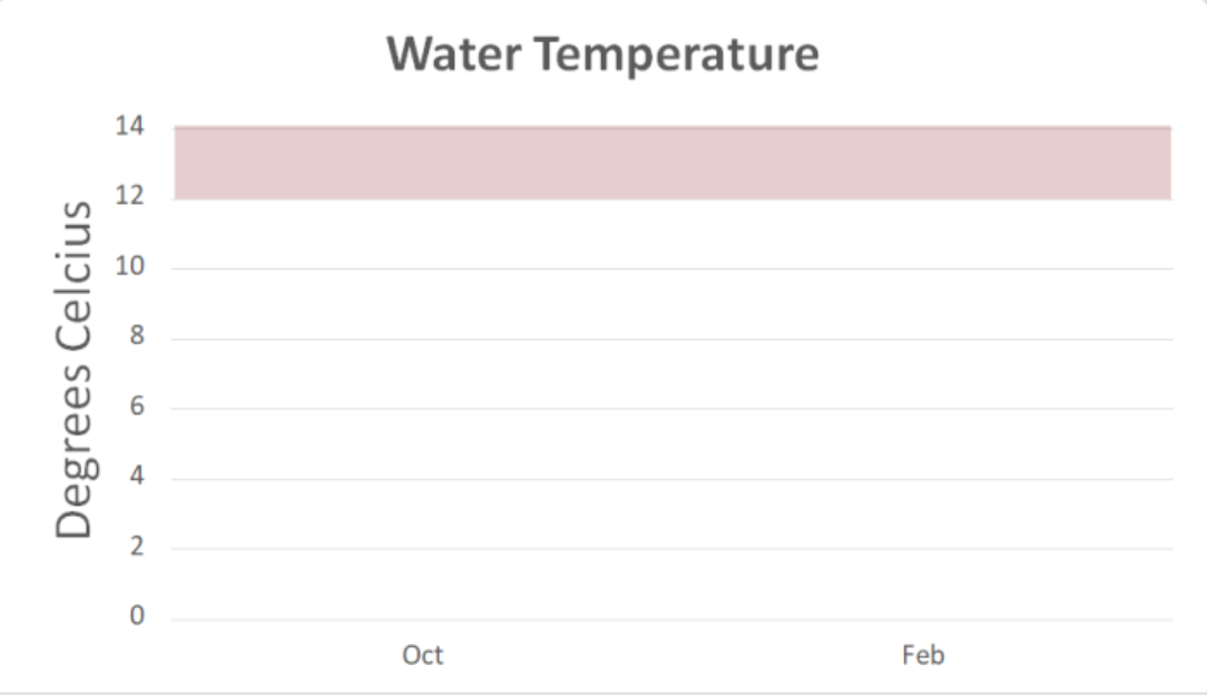
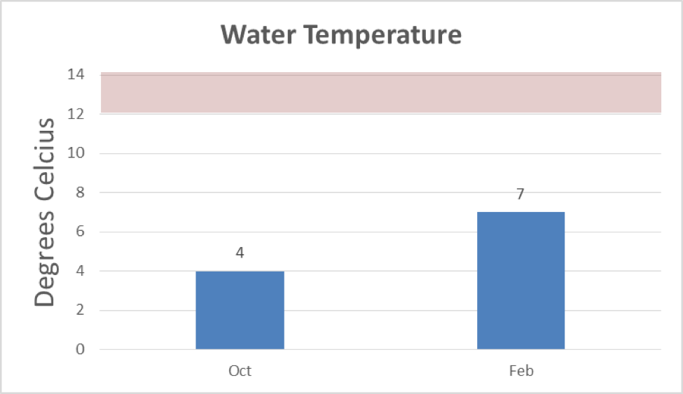
- You’ll notice that most of the graph has a white background, while a section at the top has a red background. Why would that section be colored differently? We can use bar graphs to not only show raw data, but to show if that data is an optimal value or not! For this parameter, salmon prefer temperature below 12 degrees Celsius, so if your bar graph falls below that red area, the data is within the optimal range for salmon. If your bar graphs fall in this red area, the parameter is not ideal for salmon.
- Draw your own bar graph using this template and the temperature data provided – you can use whatever colors you’d like! What happened to the temperature between October and February? Why would the temperature have changed?
- Now look at this bar graph we created based on the temperature data. Does your graph look the same? Is the data in the optimal range for salmon in both October and February?
- Want to see if you agree with the Pioneer students’ assessment of the water quality? Check out their full presentation here!
- Optional: If you have a thermometer at home, you can test the temperature of various water sources and create your own data table and bar graph! Try testing water from the cold tap, water from the hot tap, water from a nearby stream or pond, water from a puddle, etc.
- Make more bar graphs for each of the other parameters provided. Based on what you’ve learned about DO, turbidity, nitrates, and pH, what might have caused these values to change from one season to the next?
Vocabulary
- Bar graph: A way to visually represent data using bars. These graphs work best when used for a few parameters or tests.
- Data table: A way to organize data values into a table format.
- Line graph: A way to visually represent data using points on a line. These graphs work best when showing change in a parameter over time.
- Optimal value: The ideal values or best case scenario of the data for whatever you are testing for. For our Water Quality Monitoring program, our optimal values are based on what is optimal for salmon.
Keep Learning!
- A few of our classes were still able to put together their Congress presentations before it was canceled this year! You can find all of those presentations on our website here.
- You can also see the whole data table for all of the water quality data collected this school year (from over 60 sites across South Sound) and other years on our Water Quality Monitoring page here.
- Find out about Student GREEN Congress on our website as well.
- Share pictures of your graphs with us on Instagram! Use the hashtag #GREENfromhome or find us at @southsoundgreen.
South Sound GREEN (Global Rivers Environmental Education Network) is a watershed education program in Thurston County that educates, empowers and connects thousands of local students in watershed studies annually. Through South Sound GREEN, participants engage in science and engineering practices related to water quality in South Sound. For more information, visit southsoundgreen.org.


